
Visual Design Of Plone Web Sites
Plone allows web site administrators and designers the ability to create unique site designs. Here’s an overview of the Plone layout, and some design examples.
What does a Plone web site look like? For years there has been a consistent design for the default Plone appearance. The default design looks generally like this:
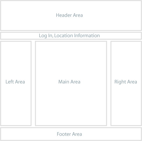
The Plone web site you use could have a design radically different from this, but you should be able to find common elements, such as the log in link and a navigation panel or menu. In the default design, the navigation menu is in the left area, and usually appears as an indented list of folders in the site. There also may be a set of tabs in the Log In, Location Information strip near the top.
We can distinguish between the design of a web site and the functionality of a web site. Quite often, these aspects of a website are also under the control of different people with different skillsets. A designer will think about the layout, the appearance and the user interface, while a content editor will think about the structure of the information.
All of these aspects can be strictly separated in Plone, and can be adjusted independent from each other.
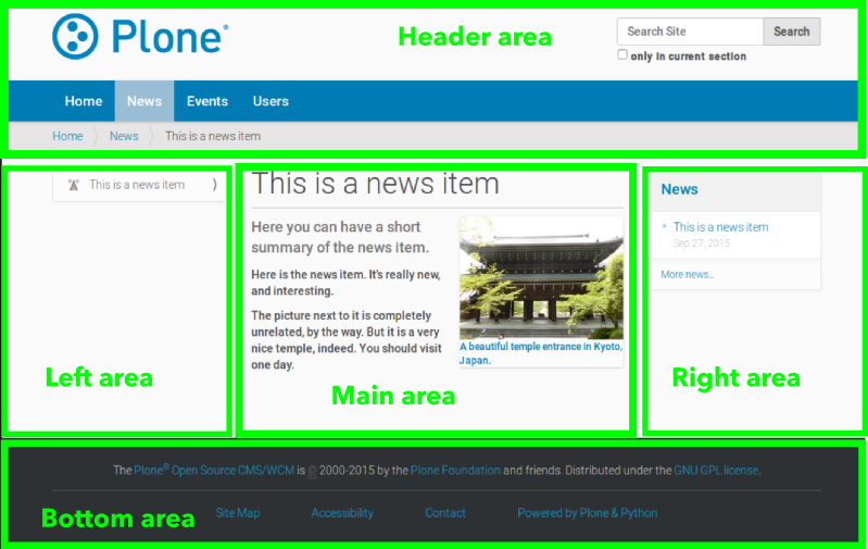
We’ll use the default Plone layout design as an example of typical divisions of the screen:
You may need to adapt these terms as needed for your Plone web site design. You may encounter varied terms for describing screen real estate, such as right and left “slots,” for the left and right column areas, “portlet,” or “viewlet,” for discrete areas or boxes, and several other terms.
For example, we can look at a web site from the list of Plone success stories to compare:
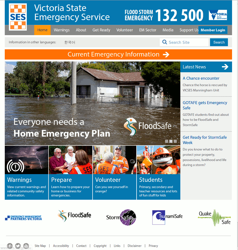
This is the Emergency Service web site for the Australian state of Victoria, giving citizens the latest update on potential natural disasters. The header section has the main navigation tabs, and a login for members. The left area lists the latest news. The main area has one large image and four columns of smaller images, serving as links to important areas of the website. At the bottom area (often known as “footer”) it has links to social media, legal information and contact information.
Nowadays, since the rise of mobile devices like tablets and smartphones, websites quite often look different depending on the screen size. On a smartphone, the navigation is often contracted into a single icon that expands when the user touches it. Also, the “left” and “right” areas may be shown after the “main” area when using a smartphone.
This technique is known as responsive design, and can be implemented using Plone. The default theme for Plone 5 uses this method already.
What does a Plone web site look like?
Traditionally, the out-of-the-box look is like that shown at the top of this page, with header, menu, columns, and a footer.
But using the flexible “Diazo” theme engine of Plone, each aspect can be made to look any way the designer chooses, and can also be shown different depending on the device of the visitor.
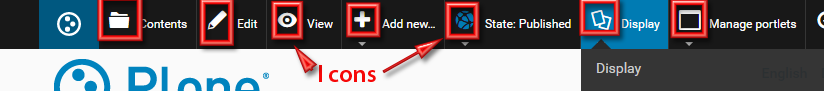
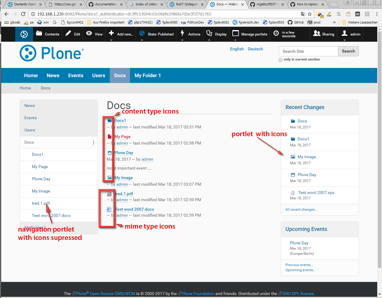
Content Type Icons
Icons are used to highlight actions, options etc. in menu bars, property sheets and the like:
Furthermore icons can be used to help to visually identify content types in any kind of listing or tables. For the content type File mime type icons are used to visualize the format of the given file.
This feature is adjustable to a very high degree. There are default settings which can be configured in the Site Configuration panel. This default settings can be overidden for each content item (edit: settings) or portlet respectively.
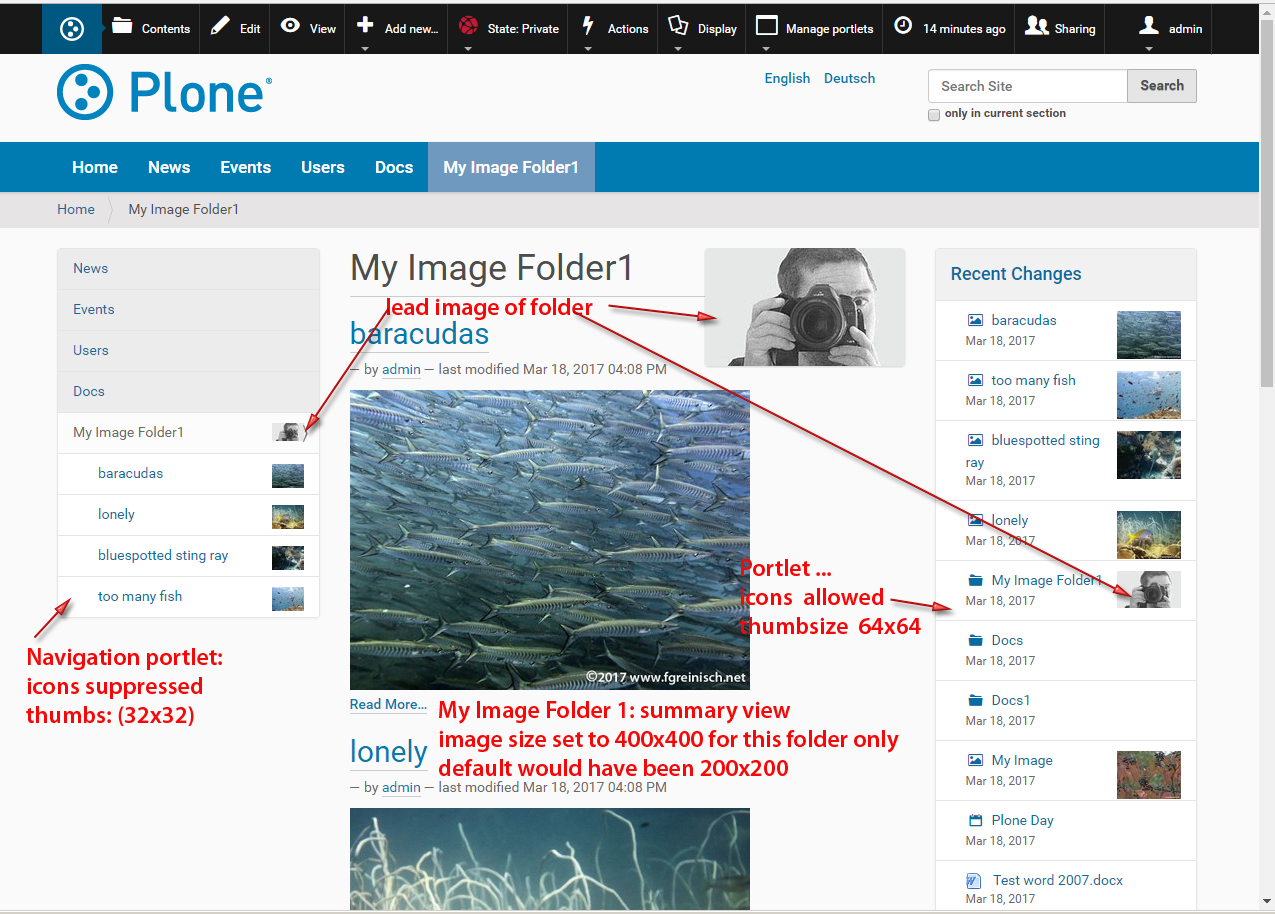
Preview Images (aka Thumbnails, Thumbs)
Preview Images (or thumbnails, thumbs) for image items or any other content items which have a lead image (or teaser image) can be shown in any listing or table. Additional to the same configuraion options for icons above you can define default sizes for the preview images for, tables, lists or portlets and also overwrite these settings individually.
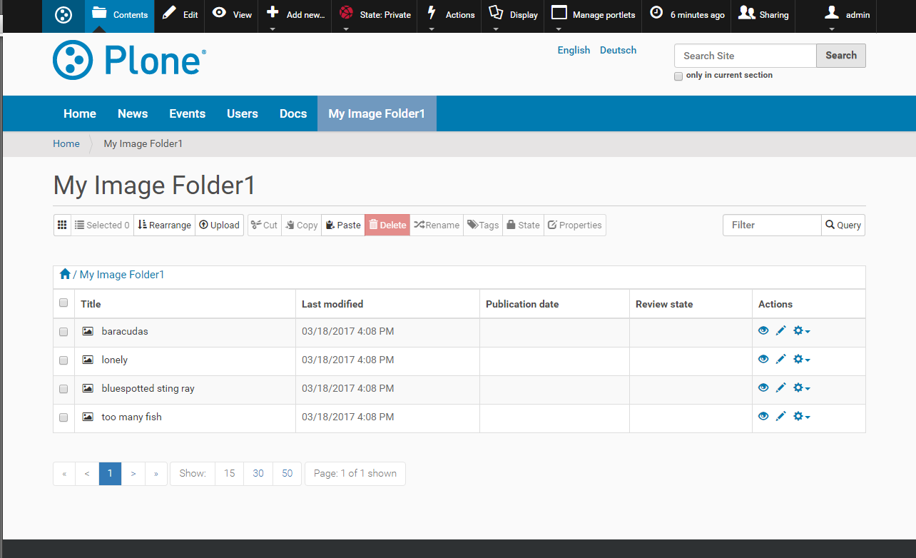
Depending on the default settings for table views the content view of a folder will show preview images or not:
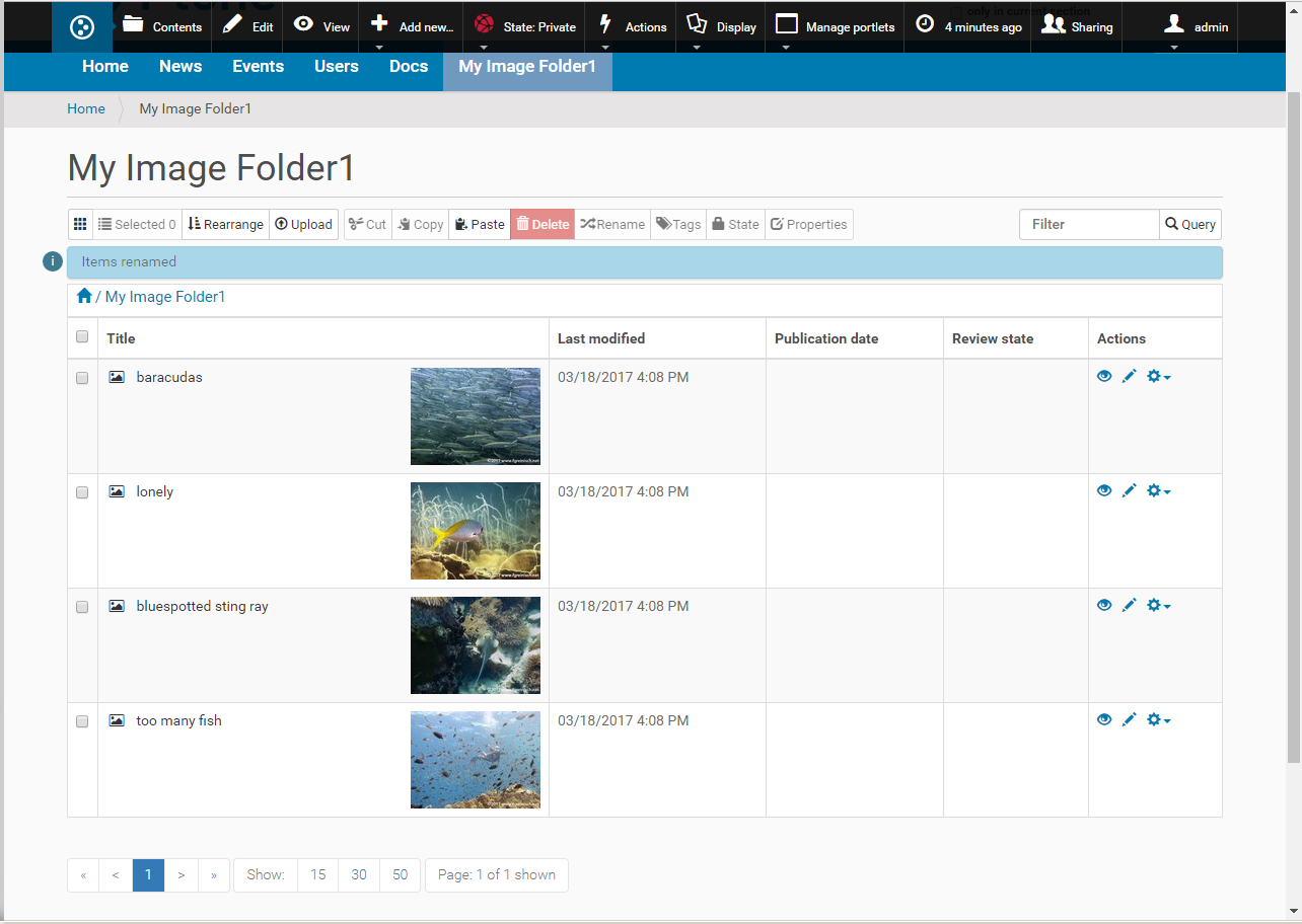
The second option (here with image size set to 128x128) is very handy whenever you need to rearrange a big number of images whith mkore or less meaningless title.